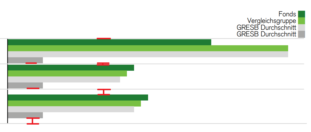
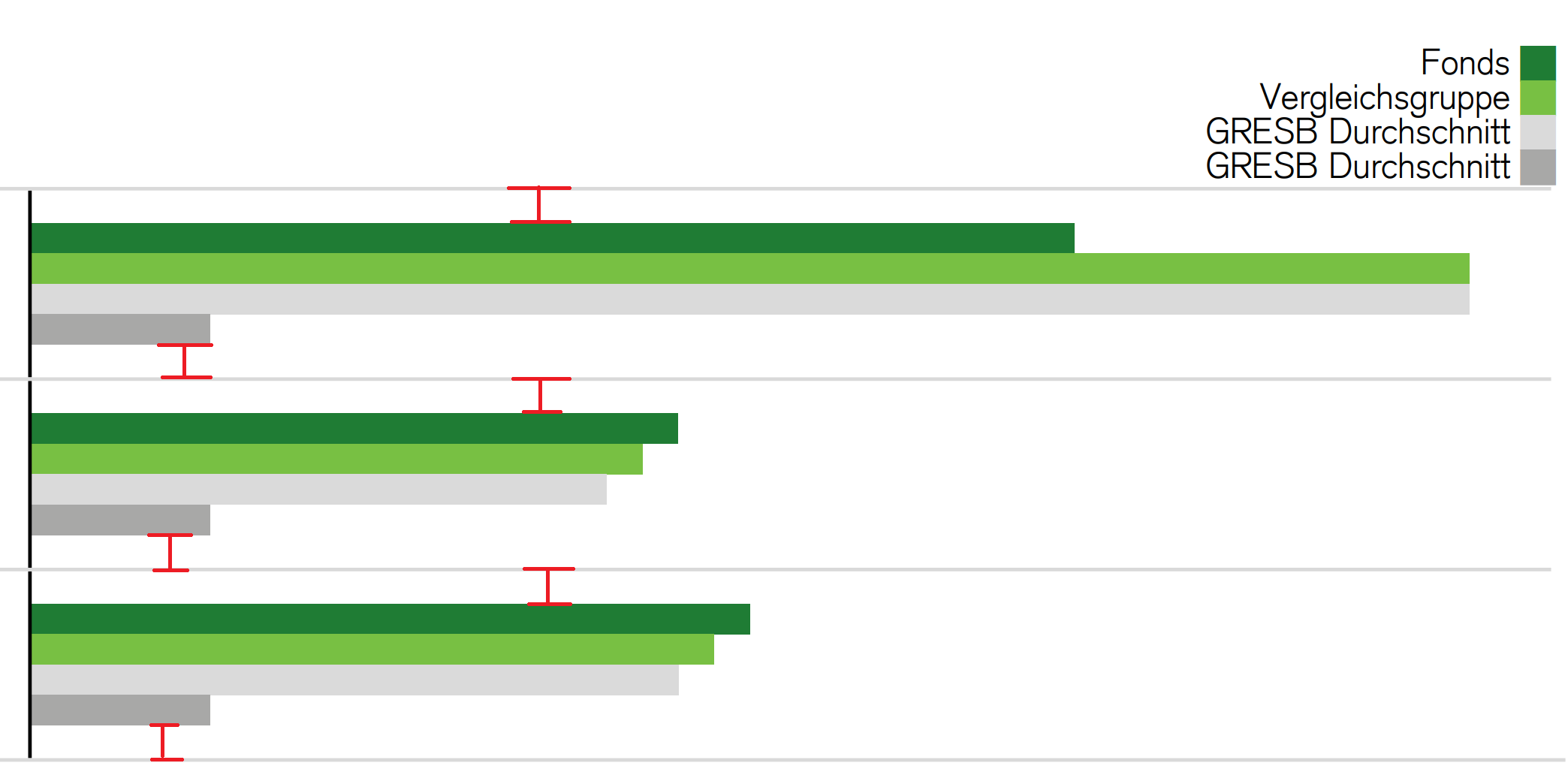
Chart
Structure
{mainTitle} | |||
{subTitle} | |||
importance secondary | importance primary | Chart Legend | |
importance primary | |||
importance primary | |||
Usage
Add a new “Chart Legend” column in a table style to allow for horizontal bar charts to be inserted

Expand word template table style with column “Chart Legend”

Modify header cell (i.e., cell with “Chart Legend” in word template) to apply style & alignment to chart legend in report
“Chart Legend” text should be on the level of the column groups. The chart legend is then produced by merging the column group and column cells together.
If any chart column does not have a name set or is set to empty string (““), the chart legend will not be generated
Bar coloring follows the defined theme. Once all colors are used, they start cycling.
The column width can be set by setting
tableChart.chartColumnWidthin the metadata (see below on how to set metadata) or theDimensionGroup.widthpropertyThe last column width need to be set in percent
Table Style Metadata
Table Style Metadata Parameter | Explanation | Default | Visualization |
|---|---|---|---|
| Defines the color of the border line between negative and positive bar chart. This value is set in Hex. | #000000 (Black) | |
| Defines the width of the border line between negative and positive bar chart. This value is set in pt. | 0.5 pt | |
| Defines the desired bar height in the chart. This value is only effective if no resizing (proportional shrinking) of the chart is required. This value is set in pt. | 8.50394pt (0.3 cm) | |
| Defines the minimal width of the negative and positive bar chart side. This value is set in mm. | 4 mm |  Note: The margin of the cell itself is determined by the word template |
| Defines the minimum bar height in the chart. This value is guaranteed and will force the cell height to grow if necessary. This value is set in pt. | 4.25197 pt (0.15 cm) | |
(new) | Defines the minimal vertical padding for the bar chart. Notes:
This value is set in pt. | Depends | 

|
| Defines string aliases to be used for the otherwise numeric This value of ex.:
CODE
Note: Many table-chart BBs support the parameter |
Behavior
The axis is positioned based on the data in the abstract report. There are four positions with a distance of 25% of the column width of eachother. If there are no negative values, the axis is placed at position 0 (i.e. to the left). If there are only negative values smaller than 25% of the total, the axis is positioned at position 1 (which is at 25% of the column width) and so forth. Please see the the examples section for concrete applications of this principle.
Examples
Example 1: Showing a simple case with a one bar chart
output-chart_simple_case.docx template-chart_simple_case.docx abstract-report-chart_simple_case.json
Example 2: Showing how the values determine the axis position
output-chart_axis_position.docx template-chart_axis_position.docx abstract-report-chart_axis_position.json
Example 3: Showing how bar colors are repeated
template-chart_repeating_colors.docx abstract-report-chart_repeating_colors.json output-chart_repeating_colors.docx
Example 4: Showing how to change the left and right margin
abstract-report-chart_margins.json template-chart_margins.docx output-chart_margins.docx
Example 5: Showing how to set the column width using a chartColumnWidths mapping in the metadata (JSON comment)
abstract-report-chart_metadata_width.json template-chart_metadata_width.docx output-chart_metadata_width.docx
Example 6: Showing how to set the column width in the abstract report
template-chart_abstractreport_width.docx abstract-report-chart_abstractreport_width.json output-chart_abstractreport_width.docx
Example 7: Various minimumChartPaddingInPt set with table bar charts with 3 and 4 charts
template-word_standard.docx bar_chart_samples.pdf sample_ngr-3355.json
